About us


A logo that seems to pass through a separator, the diagonal separator symbolizes the orientation toward the future. The typography is based on a bold gothic font with enhanced readability. Overall, it has a T shape and the stroke thickness is the same, which gives a sense of stability.

Logo

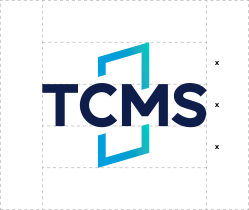
Spacing and sizing
The blue gradient color that symbolizes the orientation toward the future is used to highlight the identity of TCMS.